
PowerPoint is the premier technology when it comes to presenting information. Did you know that with a little bit of programming knowledge you can get started in coding up your own PowerPoint presentations in Python? There is a great library called python-pptx that provides utility functions for accessing and manipulating the data within a PowerPoint. Of course you should weigh the pros and cons to see if this approach would work for you.
Advantages
-
Multiple people can edit the same PowerPoint
-
We can use version control to track changes
-
Reduces the memory necessary to store files
-
Keeps your document clean
-
Makes it easier to make more consistent presentations
-
Maintain your assets
Disadvantages
-
Requires programming experience
-
Cannot use every feature of PowerPoint
If you decide it makes sense for you go ahead and make your first Presentation object in Python:
from pptx import Presentation
prs = Presentation()
Title Slide
Every presentation has one, we will learn how to add a title slide and the visual components to display text on it.
# Get a reference to a pre-existing slide layout
title_slide_layout = prs.slide_layouts[0]
# Create a slide using the given layout
slide = prs.slides.add_slide(title_slide_layout)
# Get components for updating text
title = slide.shapes.title
subtitle = slide.placeholders[1]
# Update text
title.text = "Hello, World!"
subtitle.text = "python-pptx was here!"

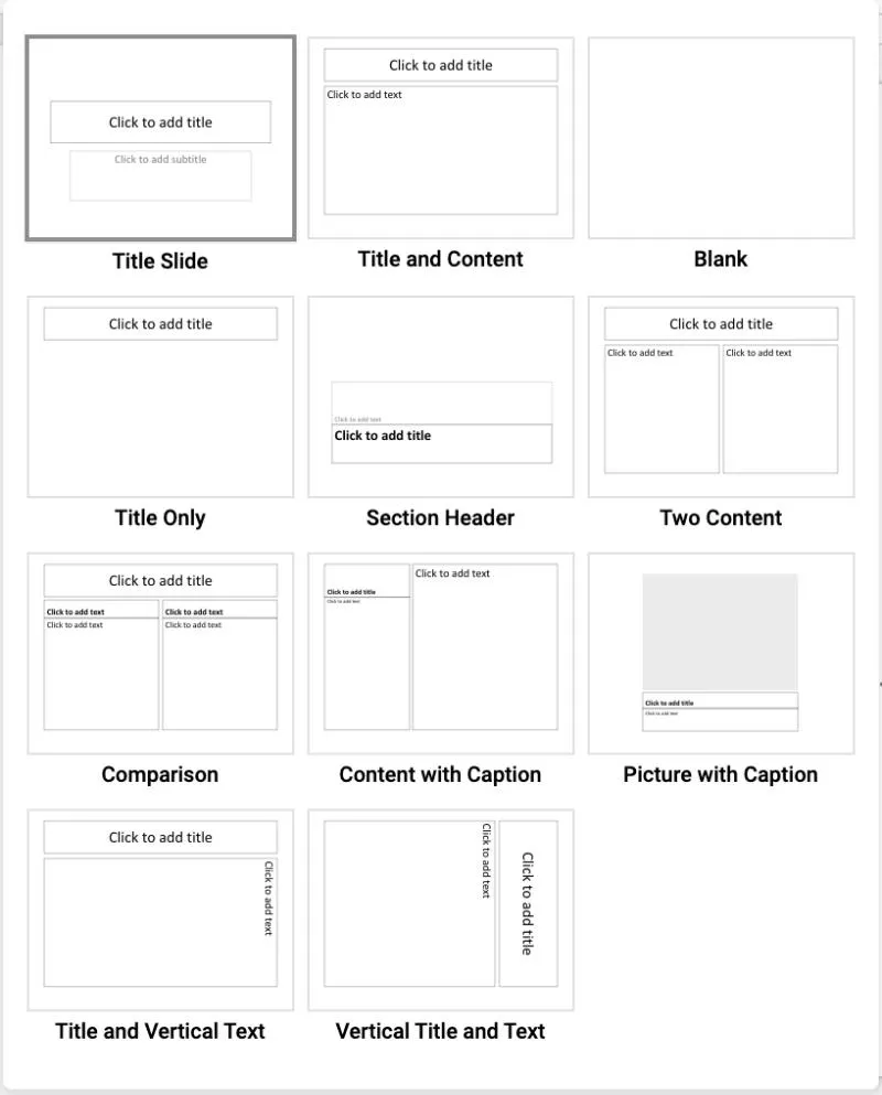
There are several layouts built into the presentation by default for you to choose from. I created constants for each type of layout for use in this and future projects.
TITLE = 0
TITLE_AND_CONTENT = 1
SECTION_HEADER = 2
TWO_CONTENT = 3
COMPARISON = 4
TITLE_ONLY = 5
BLANK = 6
CONTENT_WITH_CAPTION = 7
PICTURE_WITH_CAPTION = 8
TITLE_AND_VERTICAL_TEXT = 9
VERTICAL_TITLE_AND_TEXT = 10
Upon opening a generated PowerPoint generated by python-pptx you will see the same 11 options available although they will not be in the same order.
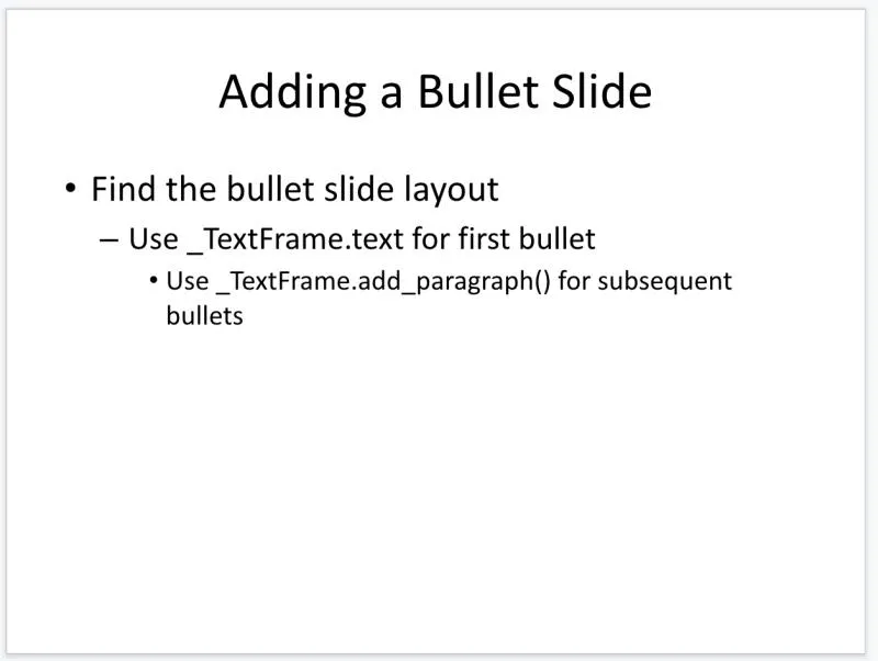
As you can see there are more complex layouts available. Below you will see how you can create and edit a slide with both title and content sections.
bullet_slide_layout = prs.slide_layouts[TITLE_AND_CONTENT]
slide = prs.slides.add_slide(bullet_slide_layout)
shapes = slide.shapes
title_shape = shapes.title
body_shape = shapes.placeholders[1]
title_shape.text = 'Adding a Bullet Slide'
tf = body_shape.text_frame
tf.text = 'Find the bullet slide layout'
p = tf.add_paragraph()
p.text = 'Use _TextFrame.text for first bullet'
# Indent the paragraph
p.level = 1
p = tf.add_paragraph()
p.text = 'Use _TextFrame.add_paragraph() for subsequent bullets'
p.level = 2
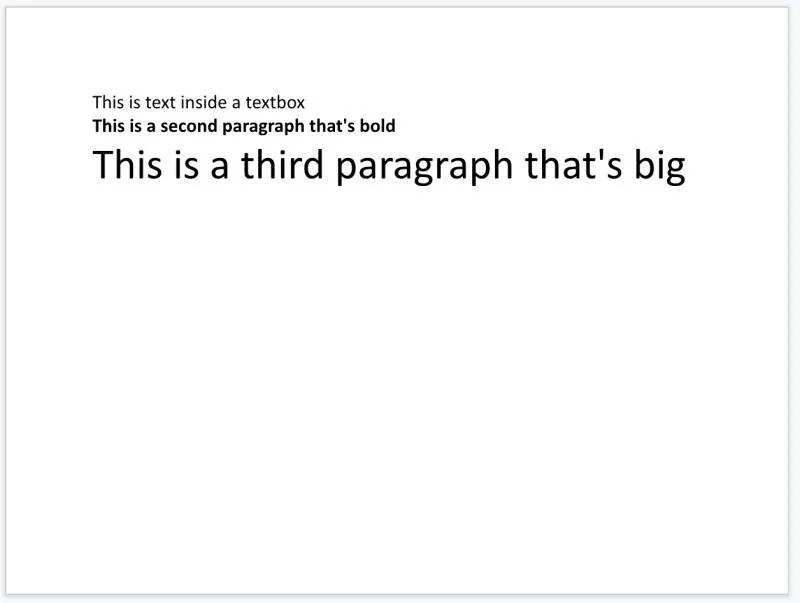
Alternatively, you can start from a blank slide layout and add components as you need them. This is a great option if you want to make your own pseudo-layouts that don’t quite fit the existing layouts. You can create a function, that when given the proper arguments, generates a go to slide layout you like to use.
from pptx.util import Inches, Pt

blank_slide_layout = prs.slide_layouts[BLANK]
slide = prs.slides.add_slide(blank_slide_layout)
# Use PowerPoint position measurements
margin = Inches(1)
# Adds a textbox with 1in margin on all sides
txBox = slide.shapes.add_textbox(margin, margin, prs.slide_width - margin * 2, prs.slide_height - margin * 2)
tf = txBox.text_frame
tf.text = "This is text inside a textbox"
p = tf.add_paragraph()
p.text = "This is a second paragraph that's bold"
p.font.bold = True
p = tf.add_paragraph()
p.text = "This is a third paragraph that's big"
# Use PowerPoint font measurements
p.font.size = Pt(40)
Eventually, you will also want to include images in your slideshows. It is just a matter of specifying image coordinates along with the image source.
img_path = 'hic.jpg'
blank_slide_layout = prs.slide_layouts[BLANK]
slide = prs.slides.add_slide(blank_slide_layout)
left = top = Inches(1)
pic = slide.shapes.add_picture(img_path, left, top)
left = Inches(4)
height = Inches(4)
pic = slide.shapes.add_picture(img_path, left, top, height=height)

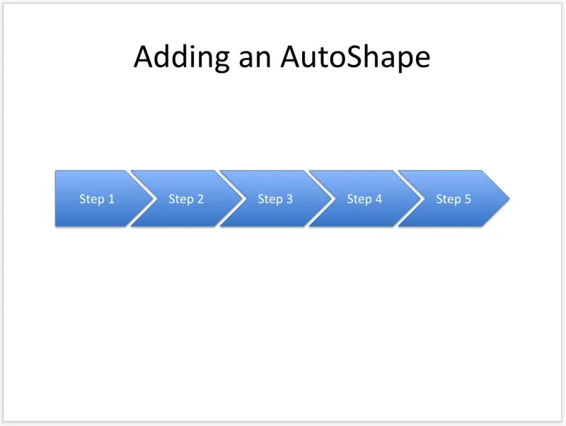
Shapes are a great option for conveying different ideas. Although not all shapes can contain text, those that do always have at least one paragraph available for text display. To ensure the text displays properly for these shapes we center them horizontally.
from pptx.enum.shapes import MSO_SHAPE
from pptx.enum.text import PP_ALIGN

title_only_slide_layout = prs.slide_layouts[TITLE_ONLY]
slide = prs.slides.add_slide(title_only_slide_layout)
shapes = slide.shapes
shapes.title.text = 'Adding an AutoShape'
# Add step 1
left = Inches(0.93)
top = Inches(3.0)
width = Inches(1.75)
height = Inches(1.0)
shape = shapes.add_shape(MSO_SHAPE.PENTAGON, left, top, width, height)
shape.text = 'Step 1'
shape.text_frame.paragraphs[0].alignment = PP_ALIGN.CENTER
left = left + width - Inches(0.4)
width = Inches(2.0)
# Add steps 2 through 6
for n in range(2, 6):
    shape = shapes.add_shape(MSO_SHAPE.CHEVRON, left, top, width, height)
    shape.text = 'Step %d' % n
    shape.text_frame.paragraphs[0].alignment = PP_ALIGN.CENTER
    left = left + width - Inches(0.4)
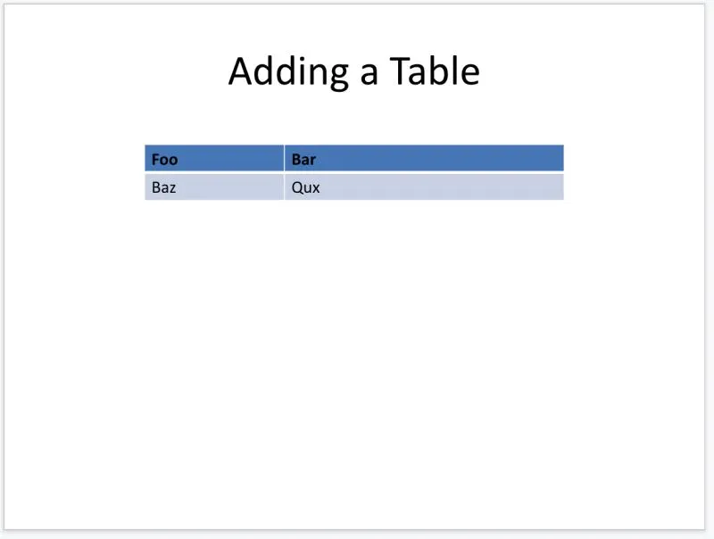
Whenever you have tabular data a table component will come in handy. With the ability to specify cell counts and sizes, you can quickly fill your tables with the data you want to show.
title_only_slide_layout = prs.slide_layouts[TITLE_ONLY]
slide = prs.slides.add_slide(title_only_slide_layout)
shapes = slide.shapes
shapes.title.text = 'Adding a Table'
rows = cols = 2
left = top = Inches(2.0)
width = Inches(6.0)
height = Inches(0.8)
table = shapes.add_table(rows, cols, left, top, width, height).table
# set column widths
table.columns[0].width = Inches(2.0)
table.columns[1].width = Inches(4.0)
# write column headings
table.cell(0, 0).text = 'Foo'
table.cell(0, 1).text = 'Bar'
# write body cells
table.cell(1, 0).text = 'Baz'
table.cell(1, 1).text = 'Qux'
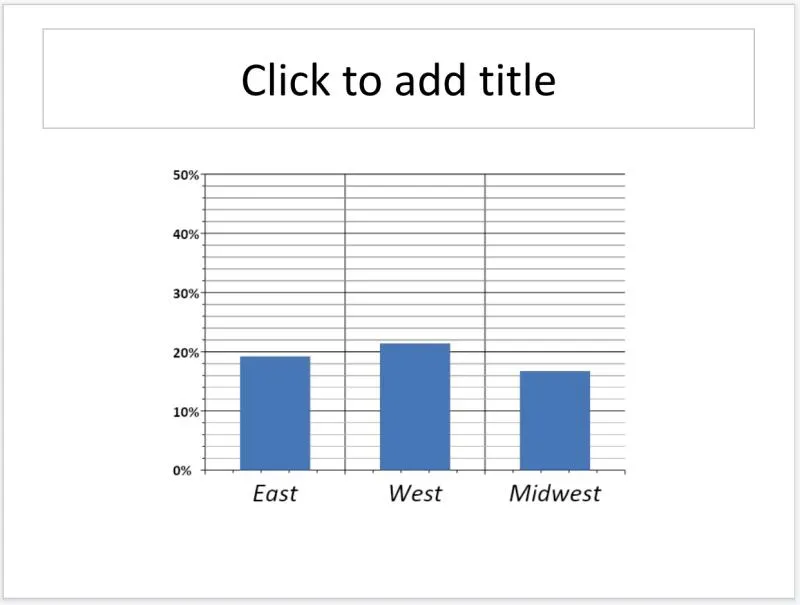
Charts
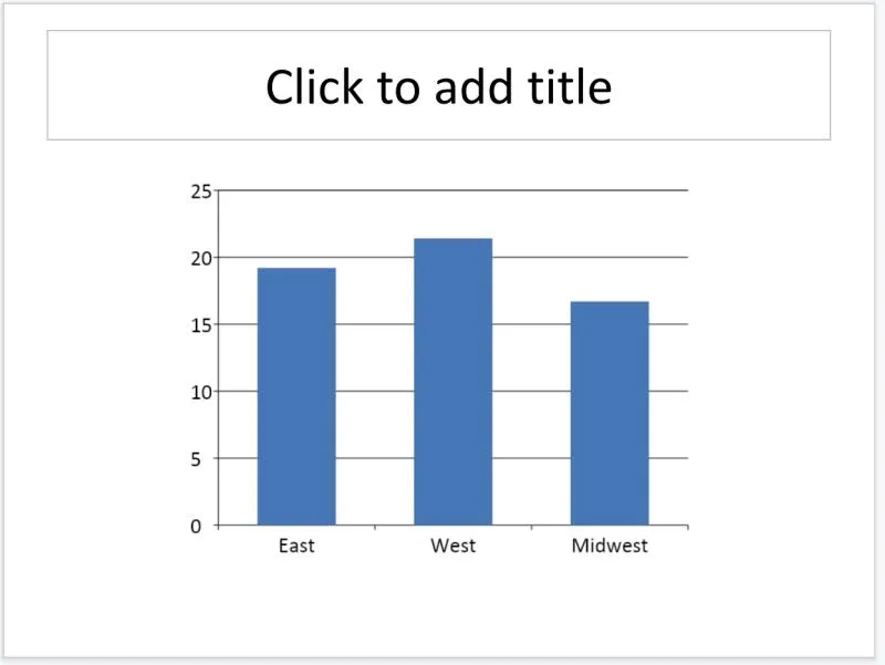
There are a lot of chart options in PowerPoint and python-pptx gives you access to them. The following code adds a single-series column chart to the presentation.
from pptx.chart.data import CategoryChartData
from pptx.enum.chart import XL_CHART_TYPE

slide = prs.slides.add_slide(prs.slide_layouts[TITLE_ONLY])
# Prepare the chart data
chart_data = CategoryChartData()
chart_data.categories = ['East', 'West', 'Midwest']
chart_data.add_series('Series 1', (19.2, 21.4, 16.7))
# Add the chart
x, y, cx, cy = Inches(2), Inches(2), Inches(6), Inches(4.5)
slide.shapes.add_chart(
    XL_CHART_TYPE.COLUMN_CLUSTERED, x, y, cx, cy, chart_data
)
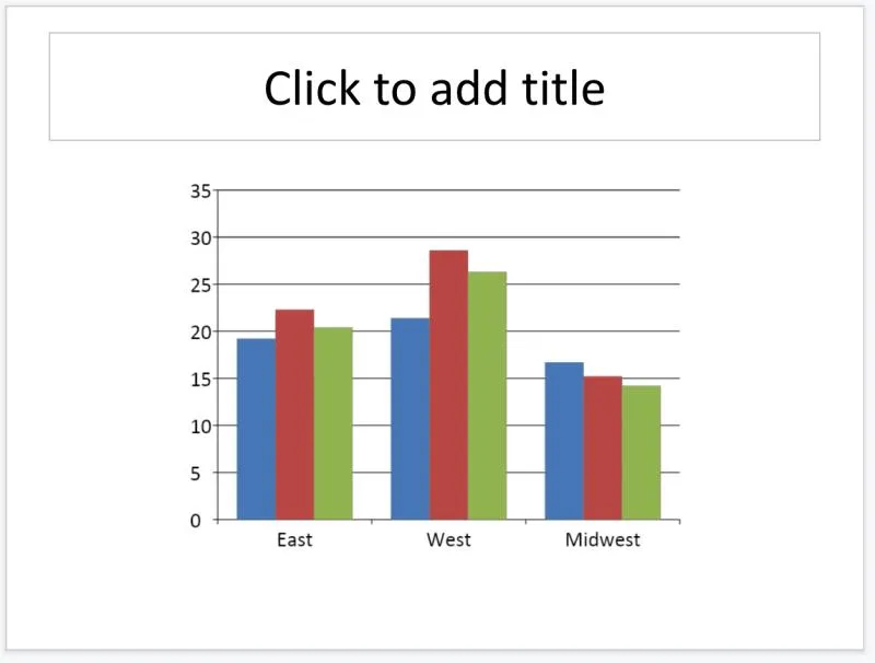
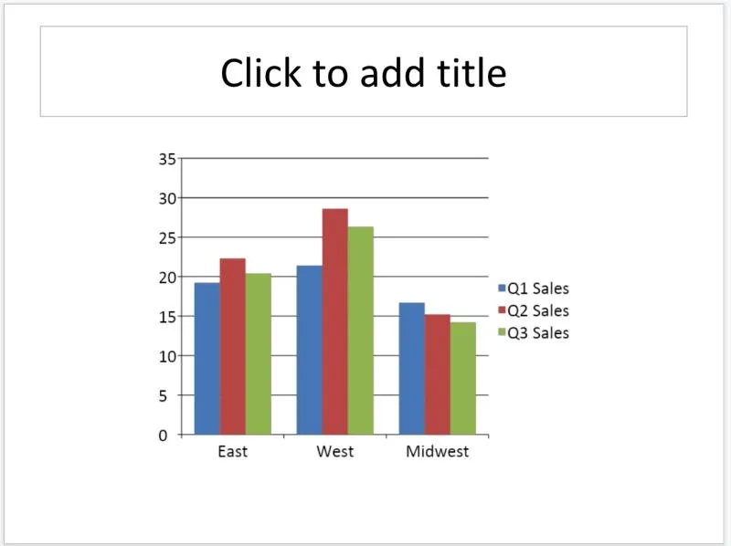
Multi-series charts are great when you have clustered data you to represent. When calling add_chart() we can capture the actual chart object and manipulate it, you will see this later in the code.
from pptx.chart.data import ChartData

slide = prs.slides.add_slide(prs.slide_layouts[TITLE_ONLY])
chart_data = ChartData()
chart_data.categories = ['East', 'West', 'Midwest']
chart_data.add_series('Q1 Sales', (19.2, 21.4, 16.7))
chart_data.add_series('Q2 Sales', (22.3, 28.6, 15.2))
chart_data.add_series('Q3 Sales', (20.4, 26.3, 14.2))
x, y, cx, cy = Inches(2), Inches(2), Inches(6), Inches(4.5)
slide.shapes.add_chart(
    XL_CHART_TYPE.COLUMN_CLUSTERED, x, y, cx, cy, chart_data
)
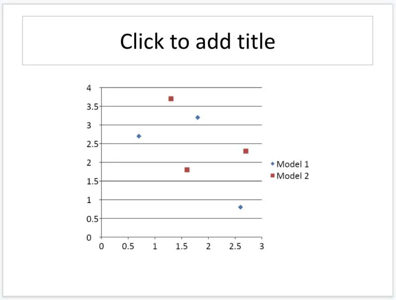
Scatter plots are a great option when you need to use a discrete set of values. This can help you to determine if maybe your data has some kind of correlation or grouping capabilities.
from pptx.chart.data import XyChartData

slide = prs.slides.add_slide(prs.slide_layouts[TITLE_ONLY])
chart_data = XyChartData()
series_1 = chart_data.add_series('Model 1')
series_1.add_data_point(0.7, 2.7)
series_1.add_data_point(1.8, 3.2)
series_1.add_data_point(2.6, 0.8)
series_2 = chart_data.add_series('Model 2')
series_2.add_data_point(1.3, 3.7)
series_2.add_data_point(2.7, 2.3)
series_2.add_data_point(1.6, 1.8)
x, y, cx, cy = Inches(2), Inches(2), Inches(6), Inches(4.5)
slide.shapes.add_chart(
    XL_CHART_TYPE.XY_SCATTER, x, y, cx, cy, chart_data
)
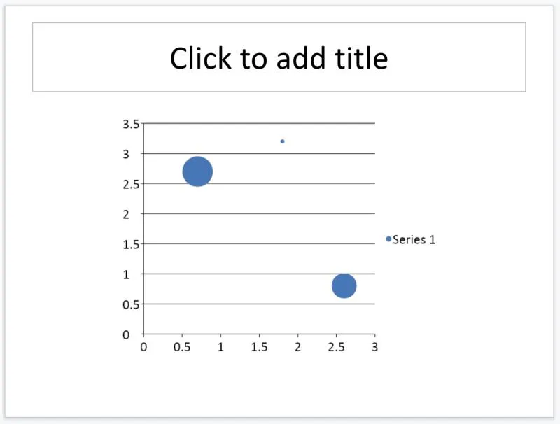
You can create a pseudo 3d graph by incorporating a bubble chart into your slideshows. The more values that fall onto point determines the size of the individual bubbles.
from pptx.chart.data import BubbleChartData

slide = prs.slides.add_slide(prs.slide_layouts[TITLE_ONLY])
chart_data = BubbleChartData()
series_1 = chart_data.add_series('Series 1')
series_1.add_data_point(0.7, 2.7, 10)
series_1.add_data_point(1.8, 3.2, 4)
series_1.add_data_point(2.6, 0.8, 8)
x, y, cx, cy = Inches(2), Inches(2), Inches(6), Inches(4.5)
slide.shapes.add_chart(
    XL_CHART_TYPE.BUBBLE, x, y, cx, cy, chart_data
)
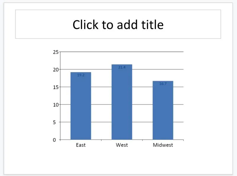
Customization
Here you will see how you can manipulate the properties of a chart from a call to slide.shapes.add_chart(...).chart. Check out how you can alter the display of graph’s axes.
from pptx.enum.chart import XL_TICK_MARK

# Style the category axis
category_axis = chart.category_axis
category_axis.has_major_gridlines = True
category_axis.minor_tick_mark = XL_TICK_MARK.OUTSIDE
category_axis.tick_labels.font.italic = True
category_axis.tick_labels.font.size = Pt(24)
# Style the value axis
value_axis = chart.value_axis
value_axis.maximum_scale = 50.0
value_axis.minor_tick_mark = XL_TICK_MARK.OUTSIDE
value_axis.has_minor_gridlines = True
# Style the tick labels
tick_labels = value_axis.tick_labels
tick_labels.number_format = '0"%"'
tick_labels.font.bold = True
tick_labels.font.size = Pt(14)
Although the customization above is a little over-kill, it does get across the point that we can do just about anything we want when it comes to controlling our graph displays. A simpler customization can include labeling our data.
from pptx.enum.chart import XL_LABEL_POSITION
from pptx.dml.color import RGBColor

plot = chart.plots[0]
plot.has_data_labels = True
data_labels = plot.data_labels
data_labels.font.size = Pt(13)
data_labels.font.color.rgb = RGBColor(0x0A, 0x42, 0x80)
data_labels.position = XL_LABEL_POSITION.INSIDE_END
The last custom style we will go over is a legend. A legend gives a name to each series and helps the reader tell which one is which.
from pptx.enum.chart import XL_LEGEND_POSITION

chart.has_legend = True
chart.legend.position = XL_LEGEND_POSITION.RIGHT
chart.legend.include_in_layout = False
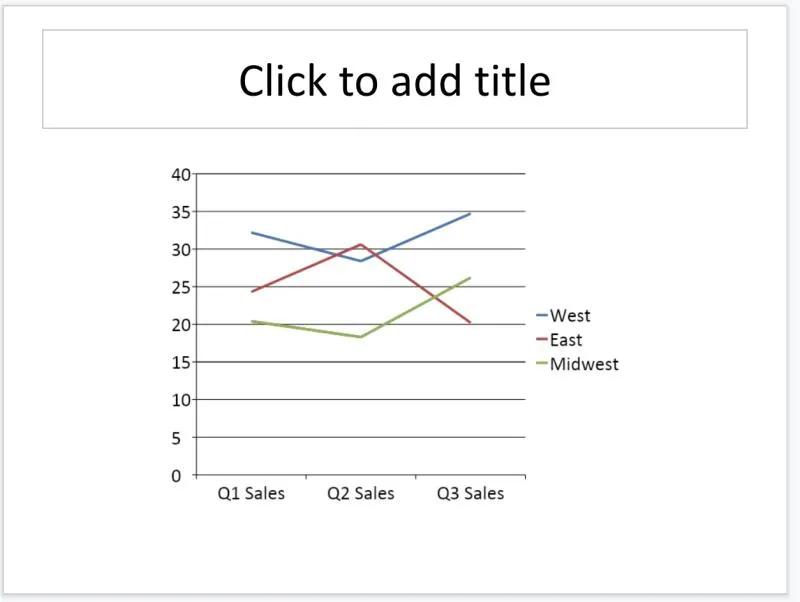
There are still many more chart types to explore. Let’s see how we can compare data over time using a line graph.
slide = prs.slides.add_slide(prs.slide_layouts[TITLE_ONLY])
chart_data = ChartData()
chart_data.categories = ['Q1 Sales', 'Q2 Sales', 'Q3 Sales']
chart_data.add_series('West',    (32.2, 28.4, 34.7))
chart_data.add_series('East',    (24.3, 30.6, 20.2))
chart_data.add_series('Midwest', (20.4, 18.3, 26.2))
x, y, cx, cy = Inches(2), Inches(2), Inches(6), Inches(4.5)
chart = slide.shapes.add_chart(
    XL_CHART_TYPE.LINE, x, y, cx, cy, chart_data
).chart
chart.has_legend = True
chart.legend.include_in_layout = False
chart.series[0].smooth = True
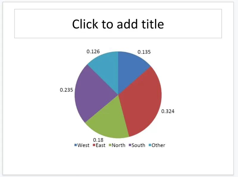
If you do not have multi-dimensional data then a pie graph could be an option to compare the weight of your data.
slide = prs.slides.add_slide(prs.slide_layouts[TITLE_ONLY])
chart_data = ChartData()
chart_data.categories = ['West', 'East', 'North', 'South', 'Other']
chart_data.add_series('Series 1', (0.135, 0.324, 0.180, 0.235, 0.126))
x, y, cx, cy = Inches(2), Inches(2), Inches(6), Inches(4.5)
chart = slide.shapes.add_chart(
    XL_CHART_TYPE.PIE, x, y, cx, cy, chart_data
).chart
chart.has_legend = True
chart.legend.position = XL_LEGEND_POSITION.BOTTOM
chart.legend.include_in_layout = False
chart.plots[0].has_data_labels = True
data_labels = chart.plots[0].data_labels
data_labels.number_format = '0%'
data_labels.position = XL_LABEL_POSITION.OUTSIDE_END
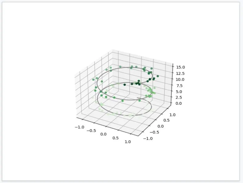
Sometimes there are certain capabilities that are beyond PowerPoint or python-pptx. Other times you simply do not want to learn a new way to create graphs. For these situations you can use your knowledge from matplotlib to create graphs, even ones with 3D displays.
import numpy as np
import matplotlib.pyplot as plt

fig = plt.figure()
ax = plt.axes(projection='3d')
# Data for a three-dimensional line
zline = np.linspace(0, 15, 1000)
xline = np.sin(zline)
yline = np.cos(zline)
ax.plot3D(xline, yline, zline, 'gray')
# Data for three-dimensional scattered points
zdata = 15 * np.random.random(100)
xdata = np.sin(zdata) + 0.1 * np.random.randn(100)
ydata = np.cos(zdata) + 0.1 * np.random.randn(100)
ax.scatter3D(xdata, ydata, zdata, c=zdata, cmap='Greens')
# save
img_path = 'output/3d.png'
plt.savefig(img_path)
If you are curious about what all of the other layouts look like you can run a loop to simply generate each one along with its name. When you have finished updating your PowerPoint in code make sure you save it.
for layout in prs.slide_layouts:
    slide = prs.slides.add_slide(layout)
    txBox = slide.shapes.add_textbox(0, 0, prs.slide_width, Inches(1))
    tf = txBox.text_frame
    tf.text = layout.name
    tf.size = Pt(12)
# Save the PowerPoint
prs.save('output/test.pptx')
This should be enough to get you started with adding slides to your presentation with python-pptx. Be sure to check out the API documentation for more options. An important observation: look at the file size of a generated PowerPoint vs our Python code. In our case it is 170kb (pptx) vs 13kb (Python + Image). This could huge when considering if you want to use Python to generate your future PowerPoint presentations. Plus since you are using simple code, version control is much more effective.
Another thing to know is that PowerPoint file outputs are actually just a zip file in disguise. If you were to rename the extension of the file to .zip you could unzip it and analyze the contents of the document. If you want to access the source code.